Bar plots can be created in R using the barplot() function. We can supply a vector or matrix to this function. If we supply a vector, the plot will have bars with their heights equal to the elements in the vector.
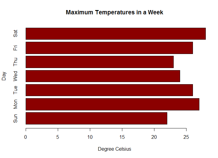
Let us suppose, we have a vector of maximum temperatures (in degree Celsius) for seven days as follows.
max.temp <- c(22, 27, 26, 24, 23, 26, 28)
Now we can make a bar plot out of this data.
barplot(max.temp)

This function can take a lot of arguments to control the way our data is plotted. You can read about them in the help section ?barplot.
Some of the frequently used ones are, main to give the title, xlab and ylab to provide labels for the axes, names.arg for naming each bar, col to define color etc.
We can also plot bars horizontally by providing the argument horiz = TRUE.
# barchart with added parameters
barplot(max.temp,
main = "Maximum Temperatures in a Week",
xlab = "Degree Celsius",
ylab = "Day",
names.arg = c("Sun", "Mon", "Tue", "Wed", "Thu", "Fri", "Sat"),
col = "darkred",
horiz = TRUE)

Plotting Categorical Data
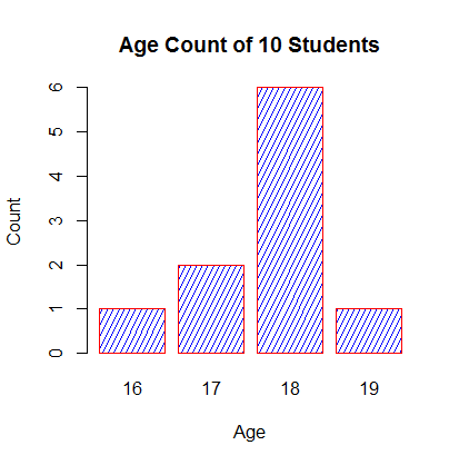
Sometimes we have to plot the count of each item as bar plots from categorical data. For example, here is a vector of age of 10 college freshmen.
age <- c(17,18,18,17,18,19,18,16,18,18)
Simply doing barplot(age) will not give us the required plot. It will plot 10 bars with height equal to the student's age. But we want to know the number of students in each age category.
This count can be quickly found using the table() function, as shown below.
table(age)
Output
age
16 17 18 19
 1  2  6  1
Now plotting this data will give our required bar plot. Note below, that we define the argument density to shade the bars.
barplot(table(age),
main="Age Count of 10 Students",
xlab="Age",
ylab="Count",
border="red",
col="blue",
density=10
)

How to plot higher dimensional tables?
Sometimes the data is in the form of a contingency table. For example, let us take the built-in Titanic dataset.
"This data set provides information on the fate of passengers on the fatal maiden voyage of the ocean liner 'Titanic', summarized according to economic status (class), sex, age and survival."-R documentation.
Output
Class  Male Female
1st     0      0
2nd     0      0
3rd    35     17
Crew    0      0
, , Age = Adult, Survived = No
Sex
Class  Male Female
1st   118      4
2nd   154     13
3rd   387     89
Crew  670      3
, , Age = Child, Survived = Yes
Sex
Class  Male Female
1st     5      1
2nd    11     13
3rd    13     14
Crew    0      0
, , Age = Adult, Survived = Yes
Sex
Class  Male Female
1st    57    140
2nd    14     80
3rd    75     76
Crew  192     20
We can see that this data has 4 dimensions, class, sex, age and survival. Suppose we wanted to bar plot the count of males and females.
In this case we can use the margin.table() function. This function sums up the table entries according to the given index.
# count according to class
margin.table(Titanic,1)
# count according to survival
margin.table(Titanic,4)
# gives total count if index is not provided
margin.table(Titanic)
Output
Class
 1st  2nd  3rd Crew
 325  285  706  885
Survived
  No  Yes
1490  711
[1] 2201
Now that we have our data in the required format, we can plot survival for example, as barplot(margin.table(Titanic,4)) or plot male vs female count as barplot(margin.table(Titanic,2)).
How to plot barplot with matrix?
As mentioned before, barplot() function can take in vectors as well as matrices. If the input is a matrix, a stacked bar is plotted. Each column of the matrix will be represented by a stacked bar.
Let us consider the following matrix which is derived from our Titanic dataset.
titanic.data
Output
Class
Survival 1st 2nd 3rd Crew
No  122 167 528  673
Yes 203 118 178  212
This data is plotted as follows.
barplot(titanic.data,
main = "Survival of Each Class",
xlab = "Class",
col = c("red","green")
)
legend("topleft",
c("Not survived","Survived"),
fill = c("red","green")
)
