Strip charts can be created using the stripchart() function in R programming language.
This function takes in a numeric vector or a list of numeric vectors, drawing a strip chart for each vector.
Let us use the built-in dataset airquality which has "Daily air quality measurements in New York, May to September 1973."-R documentation.
Example 1: Strip chart of daily air quality
str(airquality)
Output
'data.frame':	153 obs. of  6 variables:
$ Ozone  :int  41 36 12 18 NA 28 23 19 8 NA ...
 $ Solar.R:int  190 118 149 313 NA NA 299 99 19 194 ...
$ Wind   :num  7.4 8 12.6 11.5 14.3 14.9 8.6 13.8 20.1 8.6 ...
$ Temp   :int  67 72 74 62 56 66 65 59 61 69 ...
 $ Month  :int  5 5 5 5 5 5 5 5 5 5 ...
 $ Day    :int  1 2 3 4 5 6 7 8 9 10 ...
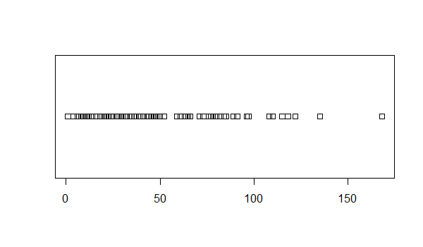
Let us make a strip chart for the ozone readings.
stripchart(airquality$Ozone)

We can see that the data is mostly cluttered below 50 with one falling outside 150.
We can pass in additional parameters to control the way our plot looks. You can read about them in the help section ?stripchart.
Some of the frequently used ones are, main-to give the title, xlab and ylab-to provide labels for the axes, method-to specify the way coincident points are plotted like stacked or jitter, col-to define color etc.
Additionally, with the argument vertical=TRUE we can plot it vertically and with pch we can specify the plotting character (square by default). Some values of pch are 0 for square, 1 for circle, 2 for triangle etc. You can see the full list in the help section ?points.
Example 2: Strip chart of airquality using jitter
stripchart(airquality$Ozone,
main="Mean ozone in parts per billion at Roosevelt Island",
xlab="Parts Per Billion",
ylab="Ozone",
method="jitter",
col="orange",
pch=1
)

Multiple Strip Charts
We can draw multiple strip charts in a single plot, by passing in a list of numeric vectors.
Let us consider the Temp field of airquality dataset. Let us also generate normal distribution with the same mean and standard deviation and plot them side by side for comparison.
# prepare the data
temp <- airquality$Temp
# gererate normal distribution with same mean and sd
tempNorm <- rnorm(200,mean=mean(temp, na.rm=TRUE), sd = sd(temp, na.rm=TRUE))
# make a list
x <- list("temp"=temp, "norm"=tempNorm)
Now we make 2 stripcharts with this list.
stripchart(x,
main="Multiple stripchart for comparision",
xlab="Degree Fahrenheit",
ylab="Temperature",
method="jitter",
col=c("orange","red"),
pch=16
)

Strip Chart from Formula
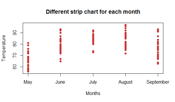
The function stripchart() can also take in formulas of the form y~x where y is a numeric vector which is grouped according to the value of x.
For example, in our dataset airquality, the Temp can be our numeric vector. Month can be our grouping variable, so that we get the strip chart for each month separately.
In our dataset, month is in the form of a number (1=January, 2=February and so on).
stripchart(Temp~Month,
data=airquality,
main="Different strip chart for each month",
xlab="Months",
ylab="Temperature",
col="brown3",
group.names=c("May","June","July","August","September"),
vertical=TRUE,
pch=16
)
