Histograms can be created using the hist() function in R programming language. This function takes in a vector of values for which the histogram is plotted.
Let us use the built-in dataset airquality which has "Daily air quality measurements in New York, May to September 1973" -R documentation.
str(airquality)
Output
'data.frame':	153 obs. of  6 variables:
$ Ozone  :int  41 36 12 18 NA 28 23 19 8 NA ...
$ Solar.R:int  190 118 149 313 NA NA 299 99 19 194 ...
 $ Wind   :num  7.4 8 12.6 11.5 14.3 14.9 8.6 13.8 20.1 8.6 ...
$ Temp   :int  67 72 74 62 56 66 65 59 61 69 ...
$ Month  :int  5 5 5 5 5 5 5 5 5 5 ...
 $ Day    :int  1 2 3 4 5 6 7 8 9 10 ...
We will use the temperature parameter which has 154 observations in degrees Fahrenheit.
Example 1: Simple histogram
Temperature <- airquality$Temp
hist(Temperature)
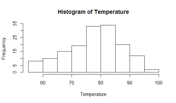
We can see above that there are 9 cells with equally spaced breaks. In this case, the height of a cell is equal to the number of observations falling in that cell.
We can pass in additional parameters to control the way our plot looks. You can read about them in the help section ?hist.
Some of the frequently used ones are, main to give the title, xlab and ylab to provide labels for the axes, xlim and ylim to provide range of the axes, col to define color etc.
Additionally, with the argument freq=FALSE we can get the probability distribution instead of the frequency.
Example 2: Histogram with added parameters
# histogram with added parameters
hist(Temperature,
main="Maximum daily temperature at La Guardia Airport",
xlab="Temperature in degrees Fahrenheit",
xlim=c(50,100),
col="darkmagenta",
freq=FALSE
)
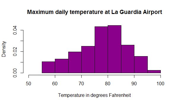
Note that the y axis is labeled density instead of frequency. In this case, the total area of the histogram is equal to 1.
Return Value of hist()
The hist() function returns a list with 6 components.
# create a histogram of the "Temperature" variable
h <- hist(Temperature)

# print the histogram object
print(h)
Output
$breaks
 [1]  55  60  65  70  75  80  85  90  95 100

$counts
 [1]  8 10 15 19 33 34 20 12  2

$density
 [1] 0.010457516 0.013071895 0.019607843 0.024836601 0.043137255
 [6] 0.044444444 0.026143791 0.015686275 0.002614379

$mids
 [1] 57.5 62.5 67.5 72.5 77.5 82.5 87.5 92.5 97.5

$xname
[1] "Temperature"

$equidist
[1] TRUE

attr(,"class")
[1] "histogram"
We see that an object of class histogram is returned which has:
breaks- places where the breaks occur,counts- the number of observations falling in that cell,density- the density of cells,mids-the midpoints of cells,xname- thexargument name andequidist- a logical value indicating if the breaks are equally spaced or not.
We can use these values for further processing.
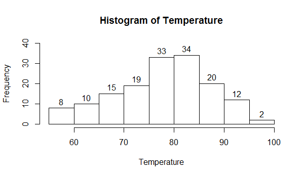
For example, in the following example we use the return values to place the counts on top of each cell using the text() function.
Example 3: Use Histogram return values for labels using text()
h <- hist(Temperature,ylim=c(0,40))
text(h$mids,h$counts,labels=h$counts, adj=c(0.5, -0.5))
Defining the Number of Breaks
With the breaks argument we can specify the number of cells we want in the histogram. However, this number is just a suggestion.
R calculates the best number of cells, keeping this suggestion in mind. Following are two histograms on the same data with different numbers of cells.
Example 4: Histogram with different breaks
hist(Temperature, breaks=4, main="With breaks=4")
hist(Temperature, breaks=20, main="With breaks=20")
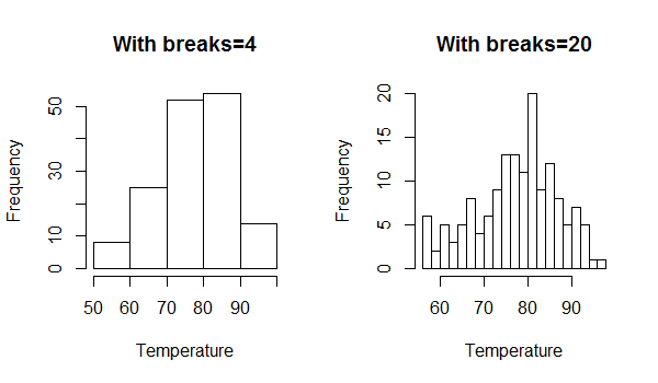
In the above figure we see that the actual number of cells plotted is greater than we had specified.
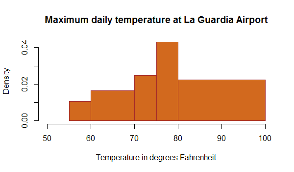
We can also define breakpoints between the cells as a vector. This makes it possible to plot a histogram with unequal intervals. In such a case, the area of the cell is proportional to the number of observations falling inside that cell.
Example 5: Histogram with non-uniform width
hist(Temperature,
main="Maximum daily temperature at La Guardia Airport",
xlab="Temperature in degrees Fahrenheit",
xlim=c(50,100),
col="chocolate",
border="brown",
breaks=c(55,60,70,75,80,100)
)
